Thread Rating:


02-29-2008, 01:29 PM
(This post was last modified: 02-29-2008, 01:34 PM by BlackcatFootball.)
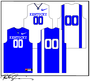
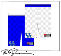
Here are the jerseys and here is the thread where the guy tells about them, if you don't believe it the guy works for a sporting goods store in Lexington and has a picture toward the bottom of the page that shows the pic from the magazine, you can also see how other teams have the new tight top and loose shorts going on. Their is a pic of Cuse', Florida and Ohio State. Our style is called Secretariat Silks after the famed horse, which you can look up and find the comparison. The shorts are also checkerboard but it is faint appearance.
Tops and Bottoms
http://i267.photobucket.com/albums/ii303..._final.gif
http://i267.photobucket.com/albums/ii303..._final.gif
Link To Catspause
http://kentucky.rivals.com/showmsg.asp?f...88&style=2
Tops and Bottoms
http://i267.photobucket.com/albums/ii303..._final.gif
http://i267.photobucket.com/albums/ii303..._final.gif
Link To Catspause
http://kentucky.rivals.com/showmsg.asp?f...88&style=2
![[-]](https://bluegrassrivals.com/forum/images/lifestyle/collapse.png)
02-29-2008, 01:36 PM
Could a mod post the pics of the jerseys and shorts.
02-29-2008, 01:52 PM

02-29-2008, 01:56 PM
Yeah, seriously, those are horrendous. What's with the racing stripes on the back?
[SIGPIC][/SIGPIC]
02-29-2008, 02:00 PM
Are they trying to go for the "we can't dress ourselves" look?
Nothing about those match. The front of the jerseys don't even match the back of the jerseys. And then the shorts don't match either, and look like a pair of shorts I had when I was 6.
Who came up with these?
Nothing about those match. The front of the jerseys don't even match the back of the jerseys. And then the shorts don't match either, and look like a pair of shorts I had when I was 6.
Who came up with these?
[SIGPIC][/SIGPIC]
02-29-2008, 02:05 PM
So I'm guessing this is what the jerseys were designed off of:
[SIGPIC][/SIGPIC]
02-29-2008, 02:08 PM
They said the jerseys have the same checkerboard pattern, but they are really faint and they tried to mix up Secretariat in with it. Read the link on Catspause to get a lot more info. I really like them, we needed something new era that comes with everything new we got.
02-29-2008, 02:10 PM
http://i271.photobucket.com/albums/jj145...jersey.jpg
pic from the magazine, these are the new line from Nike, we arent the only ones with the stripe but i believe the checkerboard is just us. Just as Texas have the horns on their shorts, kind of a custom school choice.
pic from the magazine, these are the new line from Nike, we arent the only ones with the stripe but i believe the checkerboard is just us. Just as Texas have the horns on their shorts, kind of a custom school choice.
02-29-2008, 02:29 PM
It's still really hard to see from that picture.
So the jerseys have the same checkerboard design?
So the jerseys have the same checkerboard design?
[SIGPIC][/SIGPIC]
02-29-2008, 02:35 PM
Thats what the guy said that found them, he works for a sporting goods store in Lexington and these were in the new nike catalog. The pics I first posted arent the actual but the checkerboard pattern is real light unlike it shows in the shorts, its on both the jerseys and the shorts. Basically you could only see the pattern if up close or in the right light.
02-29-2008, 04:04 PM
I would like them if the checkerboard pattern was kind of faint, like maybe a shiny look to it or something that way you could only tell it was checkerboard if the light hit it a certain way. I kind of like the tops. It's different, but in a good way.
02-29-2008, 06:56 PM
I don't like them, at all. The denim uniforms they had when Pitino was here are better than these.
02-29-2008, 07:18 PM
If its the checkered pattern you all don't like they won't be that bold and stand out like the picture above, that is a sketch up, if you go to the link of the one from the magazine you cant even notice the checkered pattern on the jerseys.
02-29-2008, 07:19 PM
Im with you Brooks, these are terrible uniforms and way worse than the denim they used as you mentioned. Coach probably picked them on a night he was stone blind drunk or high or something, good lord. Even more of a reason for UK to be laughed at.
03-01-2008, 05:08 PM
I loved the denim uniforms. We need something different.
03-01-2008, 06:01 PM
Those look horrible... Atleast get the uniforms like Syracuse, Texas, or Ohio State.
03-01-2008, 06:15 PM
I sure hope not.
03-01-2008, 06:57 PM
The image âhttp://www.kentuckybasketballcd.com/mccarty.jpgâ cannot be displayed, because it contains errors.
03-02-2008, 07:18 PM
Guys the checkerboard pattern will be on both the jerseys and shorts, but they will not be noticable as I said before, they don't even look like Oregon's so I dont know where you got that. The stripes will go down to the back of the shorts. The checkerboard will be faint and not noticeable unless in the right light. The pic I posted the guy drew up because no one could make anything out to well in the actual pic in the magazine , you also can see that above. The checkerboard will be resemble these shorts.
http://thesoccerauthority.com/shopsite_s...tsmall.jpg
http://thesoccerauthority.com/shopsite_s...tsmall.jpg
03-03-2008, 12:35 AM
http://men.style.com/images/news/0307/01/030507h.jpg
THe Florida jerseys will be like ours except they have scales and we have checkerboard pattern but they give off same effect. These will be the style of jerseys for us though. Nike also shows off their new Performance shirts also in this.
THe Florida jerseys will be like ours except they have scales and we have checkerboard pattern but they give off same effect. These will be the style of jerseys for us though. Nike also shows off their new Performance shirts also in this.
03-03-2008, 02:26 AM
I kinda like them. If the checkerboard is really faint like BlackcatFootball said, won't be bad at all.
Users browsing this thread: 6 Guest(s)
